Showing posts with label Mairin-Taj Caya Illustration. Show all posts

18 July 2016

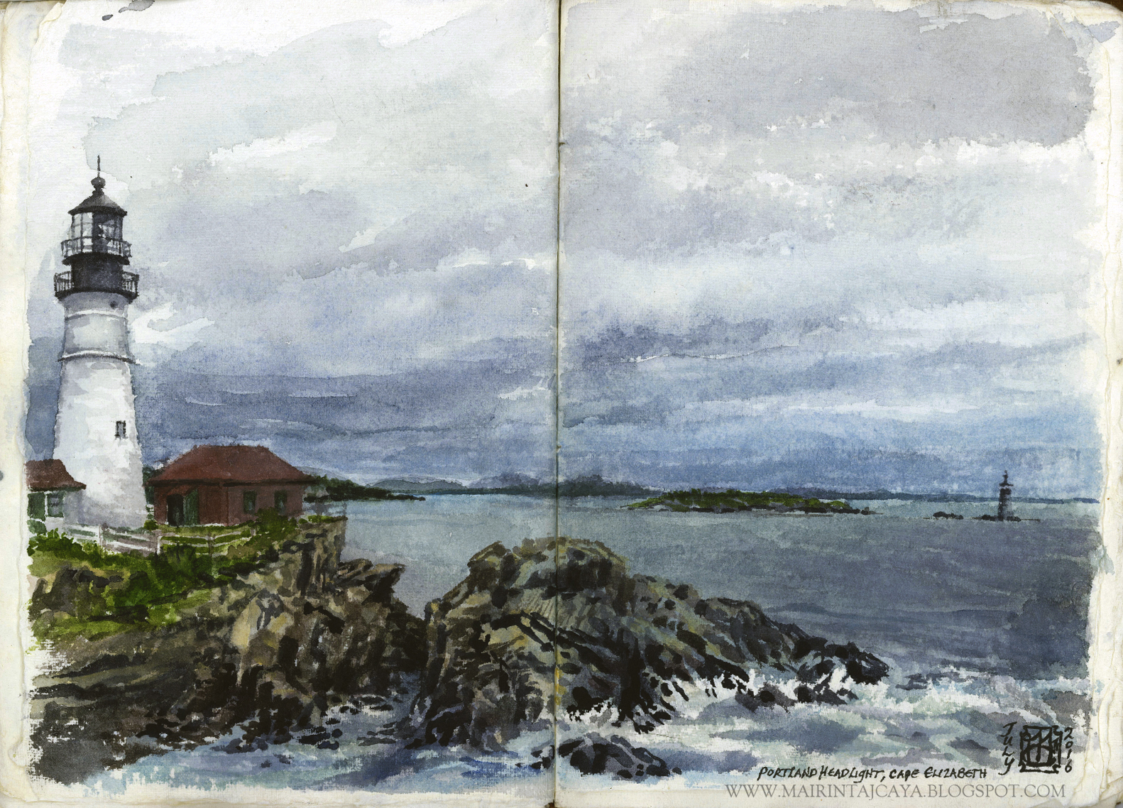
Plein Air Watercolors and Adventure in the Wilds of Maine - Summer 2016

I've taken part of July to escape into Nature.

The big 'N' has long been absent from my life - Isn't it amazing how tragic the lack of it is, but so commonplace?

Anyways, I dabbled in the unfamiliar world of plein air painting, or rough paint sketching, in my case, and produced a handful of studies to make note-like memories of truly stunning land and weather.

We visited Maine, in the far north, just a hop and a skip over from the French Canadian border, and were immersed in the lush green and wet scent of historical logging country.

Focusing on quiet expeditions out into the forested mountains and massive Moosehead Lake territory, we fumbled at balancing adventure time with art time.
It's hard to whip out the handmade book and paints to set up a study session when you're in the throws of breathless admiration for a 3196 ft rocky climb shrouded in mystery. Equally difficult to get to those art tools when you're paddling around island after island covered in unique flora and putting those muscles to good use, gazing up into the watercolor skies, out across blue layers of land, and down into the clear depths of cold northern water.

But I have some samples, and photographic evidence to share, nonetheless:

I'm sharing the scans from the book I was working in, handmade paper and leather bound, rather rustic, with hand-written notes on location and time - Fairly intimate.

Also, all the plein air watercolor sketches are done on either one page or a double page spread, making them either 5x7" or 10x7", at most.

Fairly small works, taken down between fifteen minutes and half an hour.


In a few instances, the atmosphere was so wet with mist and rain, and the washes of cool color on the paper so wet, that I had to spend most of the time on them just getting them to dry enough to add more defining strokes.
At Kelly's Landing, I was sheltered under a little bench roof, surrounded in water and rain, huddled in a raincoat, and painting on my lap, briefly. Fun!


The last one is clearly more rendered out than the earlier wilderness sketches, and was aided by a photo of the lighthouse, as I completed it on the drive back down through seven states to home.

For those not familiar, it is the famous Cape Elizabeth Portland Headlight, right on the coast of Maine. The tourists, the wedding party, the school kids, oh all of them were flocking to the place! We stayed maybe half an hour, at most.

I started it with quick washes of color notes taking down the orientation of the water, the horizon, the distant land and rock shapes, clouds, and subtle shifts between everything.

For whatever adventure's you're on, go outside, live under the sun a while, and take some art supplies with you - They make for creating more lived-in memories than photographs, in many cases.

Happy Summer!
-Mairin-Taj


31 January 2016

Building Up "The Safe Place" - Painting Process from Roots to Rendering

Sometimes the term 'build' is incredibly apt in describing the process through which a concept and all its integral, multifaceted parts, come together into a cohesive image.

As artists, we might more often tend to use words like "develop" or "compose" a concept, a composition, and these terms are accurate, certainly. But this painting, as well as a lot of other recent works I've been working on, have been "built" more than anything, and a large part of that has to do with the finer points in the way they were constructed, from start to finish.

This piece, "The Safe Place", was quite directly built out of the 11x14" space which it is placed in on the 400 lb. hot press Arches watercolor paper.

I designed my domain to work in, I roughly knocked out a thumbnail for guidance, I arranged my reference material, and I built this tree from the ground up, in one week, start to finish.

Here's the process, with some breakdown description, from that start to finish week:


This is what the start of any idea looks like on paper, for me. Loose and fast; shapes in value within a frame.

If you follow any of my social media posts for process, or have seen my blog before, you'll recognize this as my typical rough sketch and/or thumbnail approach.

And the following is the immediate result of choking back on the soft graphite pencil, letting the relaxed, dancerly strokes find my vision through rhythm, internal contour, and layered structure. Building it up into a state where I can go back in and start better defining the constructed forms with committed, articulate line weight variation and swatches of value definition:


Click the image for larger view

A close up of the woman's form to see a little more of the tonal detail I smudged in and carved out with an eraser.

I built up the tree as you see it above, more into the rest of the branches and roots, detailing shapes and lighting with rather abstract, calligraphic line work through tone and erasing of tone.

And then, once the drawing was certain, I stopped pushing it at that stage, in that medium, and switched over to watercolor washes to give me a sense of the color palette and how I wanted to paint it:


Simple reds and greens.

Building up:


Acrylics, matte medium, colored pencils...

And then lastly, the little details, before a final coal of matte medium, and spray UV varnish coats...Some serious drying and handling time...

Click the image for larger view

Click the image for larger view

With a custom framing job from my local art store that I am quite pleased to patron. It's great when you can support small, local businesses and receive not only solid work, but a good professional rapport.

-
“The Safe Place” alludes to a Native American iteration of Woman as man-kind’s bridge to Nature, how she is humanity’s opportunity to cultivate a close relationship with the Wild, and how through her, the raw self runs free. Men, with their own unique value, take heed of woman’s distinctive bond to Nature in its ever-changing force. 
This piece is an interpretation of the place, the sacred space, where she might need to go to be alone, to be unburdened, uncovered, unseen by her male counterpart, and uncaught, as well. She rests, in the safe place, in the circle, at the foot at a strong, universal icon for the natural world. There is nothing else but the tree, and her.
-

"The Safe Place" is currently showing - February 5th - 28th 2016 - with two other original works of mine as part of a group exhibition showcasing local women artists in the theme of the feminine story - girls and women's empowerment, perspectives, and beauty - #ExtremeLove for #grlsgrlsgrls at The Discerning Eye Center for the Arts - the DECA Building, Lancaster, PA.

Also, art prints of the original painting are available to order HERE

For any questions or comments, contact me directly HERE


In the meantime,
Be well in this winter,

-Mairin-Taj


08 January 2016

"Made New" To Be Included In Infected By Art's Volume 4 Publication!

Well, I'm floored - and honored - to share the news that my painting "Made New" will be included in the international annual Infected By Art's Volume 4 art book!


"Made New" - 8 1/4 x 11 1/4" - Mixed Media, 2015


Congratulations to my fellow selectees and award winners! The work I am seeing for this volume so far is stunning.

And thank you for your hard work, jury panel, Erica Berkowitz, Patrick Jones, Lauren Panepinto, and Allen Williams.


*And thank you to those two lovely mystery people who voted for this piece during the week of the separate public voting - You rock! 

Now I just have to worry about how well the hi res digital file of this will turn out when it is printed amongst such admirable artists. Eek.

Floored, 
-Mairin-Taj

03 December 2015

Infected by Art? Submit to IBA 4!

This year I took the stab and submitted a handful of relatively recent works for the call to enter Infected By Art's annual international illustrative art book. It's a prestigious contest-based annual publication, to be sure. But it isn't about being defeatist and assuming you or your work is not at the level to be accepted. It's about testing yourself out in amongst an international playing field of varied skill level with imaginative representational art.

So enter!

I'm excited and nervous, but ultimately satisfied I took the shot, and am forgetting about the results until they show up, for better or worse. Either way, it's a learning experience.

Here're the works that I've entered for the jury's consideration:

Entries:

"Made New"


"Ghost Love"


"No Man's Land"


"Orchis In His Hands"


"Welsh Immortals"

{CLICK for larger view}

Fifth entry was free, but they were all fairly cheap, considering the world of gallery and publication submission fees.

Looking forward to hearing more, and browsing the latest submissions on the IBA website.

You can view all the IBA 4 contest entries HERE


30 November 2015

"No Man's Land" - Allegorical Portrait from Concept to Completion

Like any concept, the initial visions of imagery and mood, message and methodology are springboard material at best; they are made of stuff that evolves, and is meant to mature as the idea is seized and formed by the artist.

I usually conceive of a few key words or phrases that represent the initial spark of the concept, and help guide the process of bringing it to roaring life.

In this case, I was working with the key word Soldier in my mind, as a I gathered additional information to then execute the concept into a final result.

Soldier evolved as it became evident that the title begged for something a bit more atmospheric in its description, as in a place, or a state of mind, more specifically. I didn't want the title "soldier" to leave the viewer stuck on the loaded iconography of what we currently think is a "soldier". I wanted the title to allude to there being more than the soldier of today, or the soldier of last century, or even the social, political archetype of the soldier figure, alone. I wanted it to be psychological. I wanted it to trigger the elusive, vaguely defined "no man's land"notion of a complex inner state, emotionally.

Perhaps this piece is an inside-out and backwards portrait of what the perspective of seeing through the psychological state of No Man's Land is like.

This final piece grew out of an exploratory study of the idea of "Soldier" I had - Again, that initial concept was a spark, but I knew it would not come to fruition through the creative process in the same form it began.

Here're some sample images of building up the first study to get more clear for myself exactly what I needed to articulate:


After the first small rough, you'll notice the final first study is quite textured, for my usual approach - I was playing and exploring, chasing something I wasn't sure of, and seeing how much I needed to push and pull the mediums to possible catch it. Here is the final:


This study was on a 6x6" loose hotpress watercolor paper sheet, trimmed with a deckled edge.

So I took a step back from getting to a point where I didn't have any other points to get to, for this particular study, and I looked at it with devil's advocate eyes, fresh intentions come readily to light for the concept's trajectory... What if I smoothed it down to push it back, going at it delicately, tenderly, instead...

I had a number of questions to answer, and once I did, I started again, this time with the final piece in mind.
Here's the way this more mature approach took form:

First, the watercolor on the natural white hot press paper! THEN, the graphite structures...


And now building likeness of my portrait first and foremost through layered form and structures, in graphite...

Loosely, generally addressing the broad shapes within the skull and flesh to create presence...

Be gentle and patient with your build up of layers and structures - Get the structures solidly, don't get lost in distraction at the final result.

The eyes are taking form, and therefore emotive impact, slowly building up.
A little gentle scumbling of layers along the negative space...
Almost there, but not quite. A good several more layers and details to go.
Matte medium and acrylic working it's way in through the layers...
I had to put some brush splatters in for the ash and other particulate...

And the final, signed piece:

"No Man's Land" - 6x6" - Mixed Media, 2015

There is elemental symbolism and primal allegory intended in the simplicity of this and similar works. I think there is much more depth, more human experience, behind the concept of "No Man's Land" than we give credit in this modern era's understanding of soldiers and war. 
This piece goes beyond the geographical battle field, and beyond physical isolation, or doubt, or displacement, though, those are in there as well.

The white feather, sent aloft, is an English symbol for cowardice. The flame is a universal aspect of life and spirit, verve, hope. It is important here that the eyes, the vision, is darkened, but still looking out. And it is important that the palette is pushed back, in an unidentifiable ash of atmosphere.

Keep the Fire. 

Contact me directly here for any inquiries on the availability of "No Man's Land", or for archival art prints of the work for purchase

-Mairin-Taj

27 November 2015

Happy Thanks Giving Season!

Just a brief and positive post for this important and pivotal time of the season, this year - 


This Thanks Giving, I am particularly reflective and grateful for the prominent shades of endurance, patience, strength, emotional stamina, and flexible, learning growth that have all guided inherent and necessary changes in my life, this year, so far.
I am thankful for the trajectory my work is on, for the aid and opportunity I have been given with the work made this year, and for the shows, new clients, creative colleagues, and support from loved ones that have all been involved. Here we go, into 2016...

Freerange 18lb. turkey home brined with all the seasonal trimmings from scratch!

May your holiday and your winter season be warm, loving, supportive, and proactive.
With kindness,
-Mairin-Taj

31 October 2015

"Bean Sídhe" - A Banshee for Halloween 2015!

"Bean Sídhe" - the Irish Gaelic woman of the barrows, the wailing woman, the fairy spirit heralding death, or as common culture calls her now, the Banshee... She is an ancient apparition, often one being tied to an old Irish family, or house, making there supposedly be many banshees for the many strong old tribes throughout the country.
According to myth, this particular spirit is either that of a woman who has died in childbirth, fated to play the grim role until the time she would have died of natural causes, or, a woman who has been murdered, or brutally killed.
Often robed in green or grey, she is fairly silent in solitude, dwelling like a foreboding presence, until, should someone in the family approach death, she breaks the night with chilling screams and wails.

Her association with the screech owl is a possible origin for the myth.

I liked the idea of her sudden screaming voice coming to life to be the cause of her suddenly lurching forward from her shadowy garb consumed by terror. As if trapped, she'll soon return to her hooded robes, silent once more, after death.
--
Final art is available!

If you've been following along on my Instagram - Mairintaj_InMediasRes - the behind-the-scenes process will look familiar, but the rest of the imagery following is debuting here, freshly finished, never before seen online.

Here's how I started this little seasonal vision:

1. Jump straight in on hot press with graphite:

Phase One, Graphite, 2015
Phase Two, Graphite, 2015

2. Throw on some veils of watercolor washes, building up the values to the right degree, then block in the flesh tones and richer values, colors with acrylic and colored pencil:

Phase Three, Graphite, Watercolor, Acrylic, Colored Pencil, 2015

{And I realize I'm jumping ahead here, conveniently}
3. Whittle away, through the ugly phases, into the tightening up and the final details, until it's done...To gloss over the sweaty, hard work nicely:

"Bean Sídhe" - Banshee - Final Art, Mixed Media, 5x7", 2015
The bean sídhe's detail shot, wailing, 2015
5. Find the right frame! {An understated challenge at times, but not this time, happily}

Framed, In the Studio, Now Available for Purchase, 2015
Framed, In the Studio, 2015
"Bean Sídhe" - Banshee - will be available for purchase in the premier Artists' Open Studio Auction by Strange Dreams Surreal Art Collective this Sunday, November 1st through 7th - so the first week of the month.

*Follow my social media for release of availability and open auction information!

**Find me and regular information on my Facebook Page HERE

And as always, contact me directly HERE - or please comment below! - for any questions, comments, or work interest.