15 September 2015

"What's Inspiring Now" - Edgar Maxence {1871-1954}

So!

Edgar Maxence. Currently the fresh discovery in my little (but slowly expanding) art realm who's work is a validation of much of my creative interests since I was a small child.

It continues to astound me the depth to which we artists can delve and still 'unearth' tens of thousands of beautiful works of art, brilliant past and present artists. There are so many creators in this world, and have been, throughout our part in history, that to think we - as devotees of art - can be justified in limiting our influencers to those mass-accepted rock-stars is, in a word, blind.

It takes time, energy, effort of attention and study, to continue exploring artists as yet unknown to ourselves, so it's understandable that all this work doesn't permeate the field too far from it's original society.

Still - I had never heard of Edgar Maxence! I'm stunned at myself, and more than a little disappointed I had not found him sooner. Perhaps it was my limited art education, or the fact that I have been educated in America, where only big names from other cultures are mentioned in this country? Or, certainly, the fact that I have never committed doggedly to names and dates of as many other artists as I could find, over the years. As I said, it's hard to learn about everyone.

Edgar Maxence was a French painter, born in 1871, died in 1954, trained at the École nationale supérieure des Beaux-Arts in Paris. He studied under the noted Gustave Moreau, a symbolist painter, and created much of his work utilizing the female archetype as a vehicle for his symbolic compositions.
And he worked in many mediums besides the traditional oil paint - often mixed media.

I love this chap.
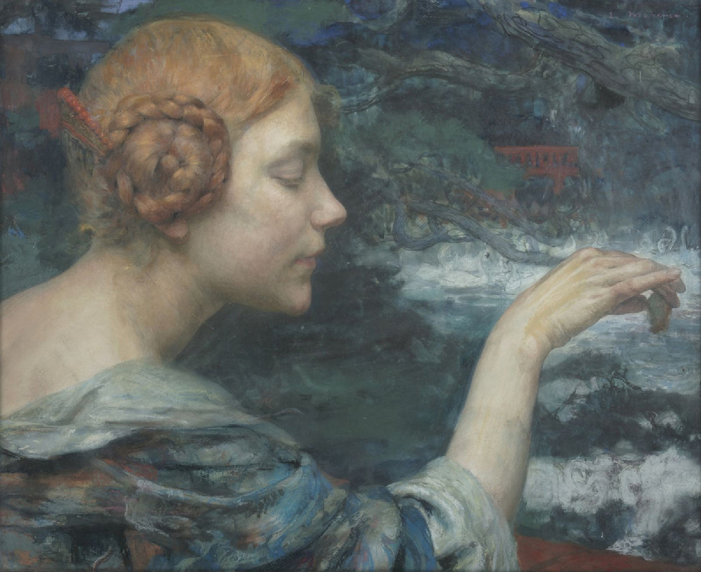
Jeune Fille Rousse Nourrissant Des Cygnes - Redhead Girl Feeding Swans, Edgar Maxence
{Watercolor and pastel!!! That's more my style}

Portrait De Jeune Fille - Portrait of a Young Girl - c.1900, Edgar Maxence 
L'Âme de la Forêt - The Spirit of the Forest - 1898, Edgar Maxence
L'Âme de la Forêt - The Spirit of the Forest - 1898, Edgar Maxence {Framed}

My own work is gaining momentum within the evolution of my personal symbolism, something I've always been inclined towards, but found myself suppressing during my training under the BFA program at PA College of Art & Design. Somewhere along the way, I lost touch with it, and therefore became more begrudging in creating work. It was a chore, trying to be an artist in line with ways of working that I didn't inherently resonate with. And I kept doing it, after school.

It's taken me these last few years after graduating from the illustration program with my degree, to re-cultivate an intimacy with the mythological and philosophically-inspired symbolism that gives me verve in my creativity, once more.
My work, I'm sure consequently, is less smothered and repressed by imposed convention, and more self-sovereign, visceral, and ready to come forth. It's braver. I feel braver.

It's an ever-unfolding experience, learning and growing forward as a creator, and we must cultivate a diverse 'garden' of both gods and fellow mortals of artists in our inspirational repertoire, all the while keeping the fire of our own unique vision.

Don't forget the inclinations that drove you in your art from your youth, and if you do a bit, then you'll find your way back by reaching out into the unknown - whether it's exploring the world, art, or other disciplines and relationships that truly touch you on a deep level - and discovering new things that trigger the inclinations buried within.

Always push forward.

More work coming soon!

In the meantime,
Happy creating!

-Mairin-Taj


11 September 2015

"In His Hands..." Susquehanna Orchid Society Annual Show and Sale

A fellow illustrator/artist friend of mine suggested I do a piece for the Susquehanna Orchid Society 32nd annual exhibition and auction, so I gave it some consideration and eventually decided to pull something together.

The historical and mythological predisposition in my inspirational repertoire instantly got me to thinking of cultural origin tales. The go-to in Western society is often Greek mythos, and I found myself dredging up the transformation of Orchis.

"Orchis Transformed" being the alternate title for this little orchid-themed painting, the creative process sprung from how Orchis, the son of a satyr and a nymph, took too enthusiastically to a priestess of the wine god Bacchus during a feast, and was therefore punished, eventually concluding in his transformation into the orchid flower. And so, for Greece, the origin of the erotic plant is explained.

I say erotic because, besides the beautiful and sensual meanings associated with the flower around the world, the orchid species has a distinctive shape to its roots - In Greek, 'orchis' means 'testicles'; when you see the roots, you'll appreciate why they made a connection between a lustful mythological man and this particular flora. 
The ancient culture also maintained that eating the roots of the orchid would help a couple achieve the desired sex of a coming child. It went something like, if the father ate the large, new tubers, the child would be a boy, and if the mother ate the smaller tubers, the child would be a girl... Strange times, back then.

Anyways, the theme for the show is of course orchids, and I wanted the focus of the art to reflect that, so keeping things simple, small, and as mood-appropriate as possible, not letting myself get caught up in the exact Mediterranean-native orchid species that would be best (which I nearly got derailed by focusing on, dorky me), I chose an attractive moth orchid and paired it with dramatic lighting, a natural palette, and tender hands. I also wanted to freshen things up a bit by using masculine hands for an intentionally graceful composition. 
Who says male anatomy can't support beauty in art? They also supported the concept better than female ones would have.

Here is the final piece, followed by a framed shot and then photos documenting the process:


"In His Hands...", 5x7", Mixed Media, 2015

With a cool little find of a frame, 2015

The frame I found for this was a serendipitous little thing, and it's border design has a delicate pattern that looks like orchid leaves to me, so the two elements seem to complete each other nicely.

Besides the research and reference of shooting a friend's hands holding a piece of rope, hah, I did the painting in watercolor, graphite, acrylic, and colored pencil, with a little medium and such thrown in, all in once place, on this little board:


Roughing in the drawing of the hands over the wash
Finding the line variation and value notes for the hands 
Underpainting stage
From underpainting...
...to painting and final touches

I greatly enjoy the puzzling intricacies in the anatomy of hands, and this was a surprising piece to discover at the end of the process. I enjoyed working on it.

Coming Exhibition:

"In His Hands..." is officially juried in to the orchid-themed exhibition for the Susquehanna Orchid Society's Annual Show and Sale, held this October at the Ware Center in downtown Lancaster, PA, in collaboration with the Mount Gretna School of Art and Lancaster Galleries.

This should be a great bunch of original art available with stunning, living ‪orchid‬ arrangements, all for show and sale, and it's *open to the public* {free admission!}

Here's some schedule information to plan by:

     Thursday, October 1st - 6:30 pm to 9 pm Preview Party

     Friday, October 2nd - noon to 8 pm Exhibits open to the public, Vendor Sales open

     Saturday, October 3rd - 9 am to 6 pm Exhibits open to the public, Vendor Sales open

     Sunday, October 4th - noon to-4 pm Exhibits open to the public, Vendor Sales open

Join us for ‪#‎LancasterArtWalk‬! And congratulations to all exhibitors!

See you there,
Until then,
Warmly,

-Mairin-Taj

28 August 2015

Welsh Trilogy - Drawing Three {Owl} - "Blodeuwedd" 'Flower Face' Owl goddess of Spring {And Final Triptych}

{To learn more about the background of this trilogy inspiration, content material, mythological context, and over all goal, Read the first blog post of this series - "drawing one" - featuring Arawn, Lord of the Underworld, HERE
...
Read the second blog post of this series - "drawing two" - featuring Rhiannon, goddess of Horses and the Hunt, HERE}

*The triptych of all finished works will be shown at the end.

-

Our last installment, and our last drawn Welsh immortal, is Blodeuwedd.

Pronounced arguably as 'blod-EYE-weth' or 'blo-day-wathe', she was created from the flowers of oak, broom, and meadowsweet blooms by two great magicians to be the most beautiful bride for the great hero Lleu Llaw Gyffes. Her name means 'flower-face', essentially.

Over the course of her story, she is transformed once more, this time into an owl, as punishment, to forever roam the night.
And in some cases, Bloduewedd is considered the goddess of Spring and owls, maintaining a vital and shape-shifting aspect to her persona, associated with the archetypal 'white goddess'.

Blodeuwedd, 'flower face' Owl goddess of Spring, 2015

Each piece in the trilogy set is drawn in graphite on soft deckled Rives BFK, 10x13" (full page), 8x10" (live area).

Blodeuwedd was completed in two days, breaking down to roughly 16 hours, not including the initial two inch gesture sketch, as seen below:

Original two inch rough concept thumbnail, on the drawing board, 2015

Laying in the values, on the drawing board, Studio shot, 2015

I work fairly loosely to start, building the inner structure of the figure I am creating with light curving strokes. I find this relaxing, and helpful to shape the grace of the human form in organic patterns or marks.

My mark making and linear work is quite confident, so you can see, in the above image, that I've found the likeness of the body fairly quickly, by eye, and I'm laying in the values immediately afterwards, building the flesh up meticulously, but easily. It's all about edges, here! 

I wanted Blod to have a kind of poised and slightly reticent quality, particularly about her face, as she is more inclined to the shadows with those owl eyes and plumage-speckled change.
With her environment and her magical origin so clearly rooted in the forested and floral world, foliage seemed a good framework for her negative space, in the drawing.

Final drawing, Detail, Graphite, 2015

And, although the order in which I drew them is how I've posted them, their intended order as a final visual trilogy set, as seen below in the original mock up, is as follows:

Original two inch vertical scale sketches, in order (triptych), Graphite, 2015
Final Artwork - "Welsh Immortals - A Mabinogion Trilogy" - Triptych, Graphite, 2015

And the final collection - "Welsh Immortals - A Mabinogion Trilogy".

Original drawings available for pre-sale only, at this time.

Art Prints of the graphite drawings are available for purchase now - Browse and order here

Full color paintings will be completed at the same size, also available for purchase as finished art-prints, also available now for pre-sale - Contact me directly, HERE

If you would like to see more, or have any comments to contribute to the project, please share below in the comments section! I'm always interested in feedback. 

For now,
As always,
-Mairin-Taj

24 August 2015

Welsh Trilogy - Drawing Two {Horse} - "Rhiannon, Goddess of Horses and the Hunt"

{To learn more about the background of this trilogy inspiration, content material, mythological context, and over all goal, Read the first blog post of this series - "drawing one" - featuring Arawn, Lord of the Underworld, HERE}

As I've said in the first installment, I'll be sharing the collective process of each of the other two works of this series separately, in their own posts, once they are likewise completed.

So now, our first of the two remaining characters, immortals, both female - Rhiannon.

She is evocative, elusive, and tauntingly ethereal queen archetype, goddess of horses and the hunt, related to the Gaulish horse goddess Epona.

Introduced in the first branch of the Mabinogion, Rhiannon cleverly catches the attention of Pwyll, the Prince of Dyfed (West Wales) as a marvel appearing on sacred ground. Mesmerized and encouraged by her rare quality, who tries to catch her for days, though she perpetually remains ahead of him, magically ambling along on her shining white steed. 

With political prowess, Rhiannon chooses Pwyll as her consort over another to whom she is already betrothed.
The queenly Rhiannon and prince Pwyll's son is Pryderi, the hero of the realm, who inherits his father's lordship of the west. The mare-like goddess and her foal son are both associated with the horse totem.

With this trilogy series, I am making a totemic connection between mythological figures and their corresponding animals, because, in these Celtic origins, Nature is married irrevocably with human experience.
So Rhiannon is golden and fair, like the white steed for which she is known to appear upon, and horse-eared.

Rhiannon, Goddess of Horses and the Hunt, 2015
As with Arawn, for the trilogy set, Rhiannon is drawn in graphite on soft deckled Rives BFK, 10x13" (full page), 8x10" (live area).

She was drawn in about 15 hours over the course of two and a half days:

Original two inch rough concept thumbnail, 2015
Laying in the values, on the drawing board, Studio shot, 2015

I wanted Rhiannon to have a posture and an attitude that was reminiscent of those playful, forceful gestures horses make with their necks as they toss their heads and look back at you.

I liked the idea of how, when horses do such things, it can be beautiful, alluring, and equally uncertain as to whether they are feigning or truly ready to demonstrate their muscular power.

I worked the 's' curve into her stance, and emphasized the shapes within her, because I wanted to admire her anatomy the way we admire similar forms in horse anatomy - The arch in the neck, the curving groove of the back, the roundness of the hip bone... And of course let's not forget the great mane; Rhiannon needed to have great waves of wildly flowing golden hair.

Final Drawing, Detail, Graphite, 2015

The next and lastly drawn member of this Immortals trilogy is the Owl...

Follow up with the final installment of this trilogy series blog post for not only a break down of the Owl, but also a look at all three finished graphite drawings together, triptych style.


Coming up next!

-Mairin-Taj

26 July 2015

Deconstructing "Made New" - From Doodle To Painting In 30 Hours...

...30 hours, plus a handful thrown in for additional drying time of the final protective clear coat layers, that is.

"Made New", then as yet untitled - but for several scribbled notes of potential theme names - began in full, here, in this single doodle drawn in my sketchbook at about a literal thumbprint size rectangle:

An early version, thumbnail sketch, 1" at most, 2015.
I always create the initial rough sketches on a tiny scale, as I learned from my favorite, prolific and wise mentors; the reason, in part, is to remove the distracting tendencies that larger scale rough sketching trap us in, which is to get caught up in the little details of an idea, an idea - concept - that is more in need of broad strokes compositional decision making than in fussing over tangential notions. It's easy to get infatuated with the first stages and running with it, but if you limit your size, you focus better on basic shapes and how they work together within your dimensions to flow into harmony.

Granted, I tend towards delicate pencil work, and I tend towards a combination of visual notes with written notes - it's just the way I think - so some of my conceptualizing is actually represented by words, not marks. I take these written notes into consideration with my visual overlay, and evolve both forms of note-taking from there. As you can see if you're reading my thumbnail, almost all of the written note components were scrapped. (They were scrapped later on, during a critical, pivotal point in the underpainting process, but I'm getting ahead of myself)... 

I'm sure it's weird, but writing has always been a key component to my creative thinking process, so I go with it - Indulge me.

Once I know where I want the shapes in the composition to go, how the figure needs to align within the negative space, I work from my sketches into the next stage - photo reference.

I often shoot myself - humorous pun inherent there - simply because it is too unavoidably convenient. I'm an artist and an artists' model, and I fit the general aesthetic for what I want to work from, and at no cost, other than the occasional contortion, to myself, so why not? Though there are times when mixing it up for the benefit of the art and for my own prevention against boredom is necessary, and I will ask a friend or work in a combination of imagination and reference.

"Made New" is a self-portrait though, so it had to be me! Here are some shots I took of myself:

Self portrait photo reference shoot, Sample reference option, 2015

This is not a good photo reference to choose for the final piece. Here's why:

     1. My hands are doing some weird, quirky finger things. Stepping back, examining it objectively, you don't want your figure in a piece to ever have any off-looking anatomical quirks, however factual they may be; the fingers on my left hand, by my mouth, are obviously capable of doing that, but in art, recreating something odd, however accurately, doesn't read well to the eye, and it break's the viewer's willing suspension of disbelief. They can't be taken along for the ride because they are looking at the fingers thinking, 'those don't look right, maybe it's a mistake'. It would be, if you chose to use them for your final.

     2. As a self portrait, a visage of the artist, a 3/4 face turned away, looking askance, gestures and secondary elements such as the hands aligned oddly, all reads as removed, unfocused, unimportant, without direction or attention. For my goals, this shot misses the point because it doesn't have the priority of the central features of the face to center on, and I want the en face presence to directly meet the viewer, because other elements coming into the composition later need to juxtapose with that. (I'm referring to the open third eye of the hawk, in the palm of the symbolic hand over my forehead). For this piece, the direct, centralized study of the face, framed with symbolic elements, is the goal.

I took many reference shots to play with angles, gesture variations, direction of main light source, and facial expression, but I chose this portrait shot in the end:

Self portrait photo reference shoot, Selected reference, 2015
In short, the hands are doing what I need them to do for the concept, but they are also looking believable, normal, not quirky. They express the gestural mood correctly. The face is full center, but still has the mood to it that I want, readable, able to be studied, but still as if in the motion of turning, looking away, inwards, and therefore redirecting attention to the 'secondary' elements of the upper hand and open third eye, and way the lower hand touches the face. I'm also in a good reference position to get rid of the attaching arm of the upper hand in the final drawing.

So I start drawing. And with this piece, due to limited time and the intended applications of the final painting, I do the final drawing directly onto the surface of the soon-to-be painting.

Final Drawing Stage, Values of the portrait and contour marking for the surrounding.
Toning the ground with cadmium red for the underpainting and beneath the gold leaf areas.
Notice how the values of the en grisaille portrait change when the surrounding space goes from white paper to toned red. I have to keep this effect of developing tone in mind as I build the rest of the painting layers and evaluate how the final impression of the portrait evolves.

Underpainting layers of watercolor and acrylic, "Made New", Studio, 2015.

Painting Progress, Ready for laying down the gold leaf over it's red ground.
After layers of watercolor, acrylic, prismacolor pencil, and fixative and matt medium, accordingly, I'm ready to address the gold leaf placement over it's red ground.

For my gold leaf approach on this piece, I did want to have the effect of the ground tone showing through. I wanted the gold to have an atmospheric quality that worked with the other elements, instead of just covering up, so having the painting underneath meant I could choose how I painted on the adhesive for the gold leaf, and know that the areas I did not deliberately paint the adhesive, the red would remain.
Notice how the gold leaf immediately cools down the piece, knocking down much of that glaring red.

With the steps of adhesive size, gold leaf application, metal-specific sealant over top, and drying time out of the way, I went back in with acrylic to the areas that needed it, tidying up and fine-tuning the details.
I also went back in and deepened the values and details of the face.

Signature, and a final sealing few coats, and the painting is ready for framing!

"Made New" - Self Portrait - 8 1/2x11 1/4", Mixed Media Painting, 2015
Large Detail - Hawk Eye Third Eye Symbolic Palm

Recently, I received the very exciting news that "Made New" has been accepted into a group exhibit this September entitled 'Self Made', a Lancaster county artist's self-portrait show sponsored by the benevolent FigLancaster and hosted by the Sunshine Art+Design gallery right here in the heart of town.

So, if you're in the area this September and would like to see the original work up close and personal, stop by the Sunshine gallery on King St - I'll be there for opening reception, along with my fellow exhibitors, many of whom are local friends, so we'd love if you said hello!

"Made New" is also showing this coming month of August for the exhibit 'Mirror, Mirror' at the HIVE Artspace in York, PA, for those in the area at that time!

Contact me directly here for any inquiries on the availability of "Made New", or for archival art prints of the work for purchase

In the meantime,
-Mairin-Taj