30 July 2016

"Scrap Sneaks" - Painting Imagined Landscapes and Light

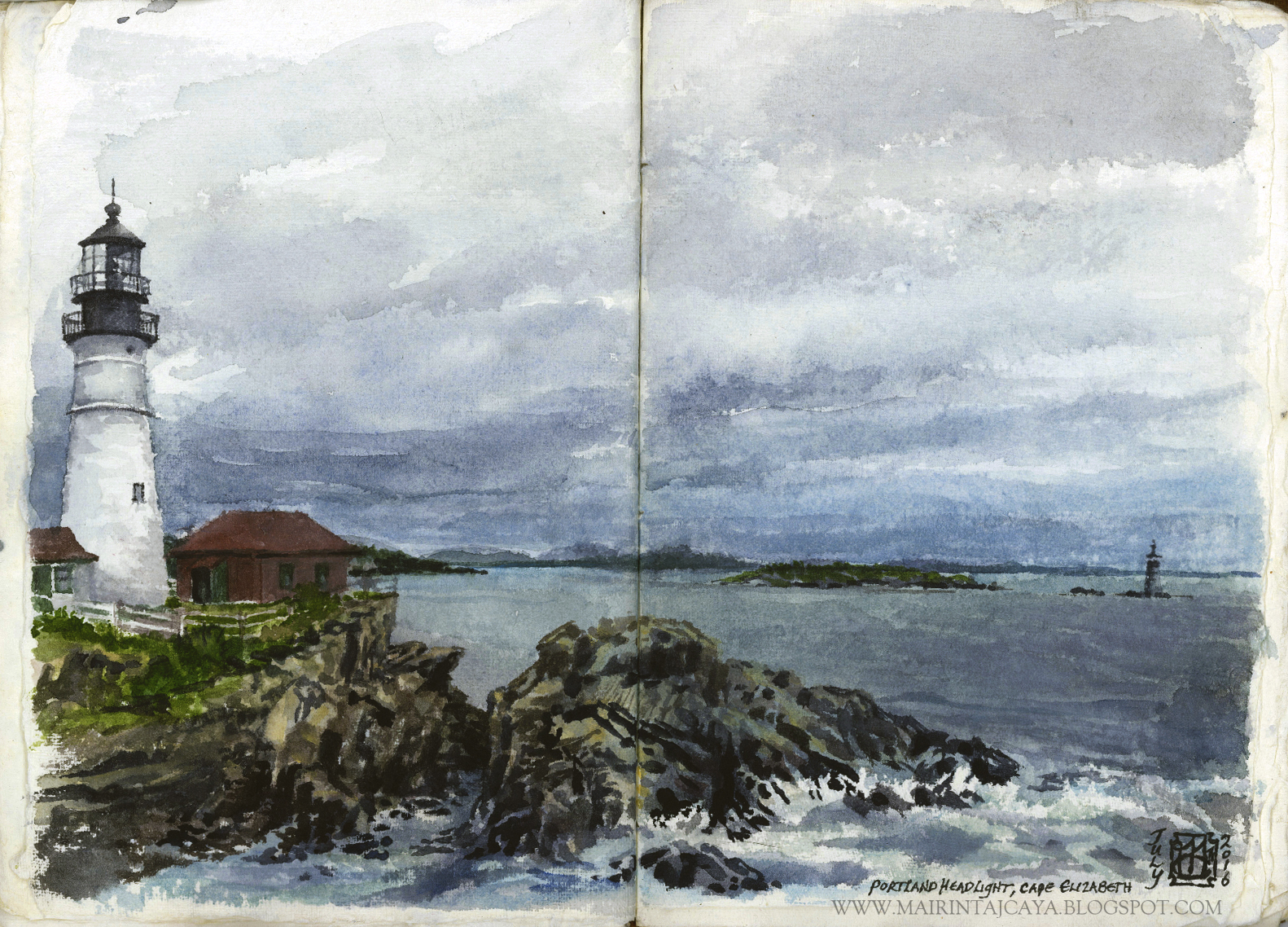
In between other work, while seated at the drawing desk and transitioning through entirely unrelated work to what I'm about to show here - graphite rendering of representational trees from observation and mythological subject allusions - I felt a need to shake something out.

I honestly had no conscious notion as to what, why, or how.

It helps, sometimes in life, to let go of the steering wheel and just see what the corporeal vehicle our psyches flutter within will do on its own.

I had some old cold-press watercolor paper primed and taped down in individual, identical squares that were waiting patiently on a board against the wall.

I took out acrylics, which, if you have seen my work, you know I rarely ever use, and never just on its own as the medium of choice.

Here's what I scribbled out, rather fast, no under drawing, no reference, just...allowing the sponged up imagination to exude some of it's visualization in a way not dissimilar to free writing.

I discovered they were landscapes, at different times of the day, with different geographical features as focus.

All are acrylic on primed cold-press, 3x3", a total of six, and I deliberately restricted myself to two brushes.

It was a refreshing exercise for me, and I am glad to have this group to gain further insight into how my learning is going.

I'm not sure if these will have any future application or if they are just what they are, and I'll occasionally add to the batch... We'll see!

Sundown over Tree Hill
Twilight over Lowlands
Moonrise across Valley
Sunrise across Fields
Daylight through Woods
Sundown beyond Waves

I'm not sure why I jumped to water for that last one, but it was a playful flurry of color, and it was fun to try out.

Which one is your favorite?

So those are some recent scrap sneaks from the studio - It's been a while, I know. More to come!

Happy creating,
-Mairin-Taj

18 July 2016

Plein Air Watercolors and Adventure in the Wilds of Maine - Summer 2016

I've taken part of July to escape into Nature.

The big 'N' has long been absent from my life - Isn't it amazing how tragic the lack of it is, but so commonplace?

Anyways, I dabbled in the unfamiliar world of plein air painting, or rough paint sketching, in my case, and produced a handful of studies to make note-like memories of truly stunning land and weather.

We visited Maine, in the far north, just a hop and a skip over from the French Canadian border, and were immersed in the lush green and wet scent of historical logging country.

Focusing on quiet expeditions out into the forested mountains and massive Moosehead Lake territory, we fumbled at balancing adventure time with art time.
It's hard to whip out the handmade book and paints to set up a study session when you're in the throws of breathless admiration for a 3196 ft rocky climb shrouded in mystery. Equally difficult to get to those art tools when you're paddling around island after island covered in unique flora and putting those muscles to good use, gazing up into the watercolor skies, out across blue layers of land, and down into the clear depths of cold northern water.

But I have some samples, and photographic evidence to share, nonetheless:

I'm sharing the scans from the book I was working in, handmade paper and leather bound, rather rustic, with hand-written notes on location and time - Fairly intimate.

Also, all the plein air watercolor sketches are done on either one page or a double page spread, making them either 5x7" or 10x7", at most.

Fairly small works, taken down between fifteen minutes and half an hour.


In a few instances, the atmosphere was so wet with mist and rain, and the washes of cool color on the paper so wet, that I had to spend most of the time on them just getting them to dry enough to add more defining strokes.
At Kelly's Landing, I was sheltered under a little bench roof, surrounded in water and rain, huddled in a raincoat, and painting on my lap, briefly. Fun!


The last one is clearly more rendered out than the earlier wilderness sketches, and was aided by a photo of the lighthouse, as I completed it on the drive back down through seven states to home.

For those not familiar, it is the famous Cape Elizabeth Portland Headlight, right on the coast of Maine. The tourists, the wedding party, the school kids, oh all of them were flocking to the place! We stayed maybe half an hour, at most.

I started it with quick washes of color notes taking down the orientation of the water, the horizon, the distant land and rock shapes, clouds, and subtle shifts between everything.

For whatever adventure's you're on, go outside, live under the sun a while, and take some art supplies with you - They make for creating more lived-in memories than photographs, in many cases.

Happy Summer!
-Mairin-Taj


06 June 2016

Connecting Water and Heaven - Tree Post V

The Infinity Tree, the tree bridge, merges water and sky through the realms of Ether.

Or so many origin myths allude.

This tree is the vision. We have the final drawing stage for this iteration, precursor to the painting, and a part of the Tree Bridge series.

I'm showing the final drawing, but also, I have some more conceptual roughs to shed some light on. These additional process sketches came out of the process for the painting, now beginning its fresh life on the studio board.

From the last tree post, IV, here's the rest of the development in rendering the drawing out:


"The Infinity Tree"


Final drawing with graphite and graphite wash on hot press, 10x15".

I do not have this framed yet, as the final drawing frame is a special project in itself. I'm building it out of not-so-standard materials for a unique finish. More for that along with the painting development!

I still need to make full size scans, as well.

Pre-Orders for art prints of the drawing are available now.

Contact me directly for interest here

But then there are those conceptual roughs that I peppered throughout the process of this drawing development.

To shake the creative process up a bit, and keep the blood oxygenated nicely along the way, these were done in mixed media on drawing paper, with the tempting gold leaf touch.

Here are some process and detail samples:


Notice, these concept roughs are all not only mixed media, but an abstraction of representational tree form, designed and gestural, each at approximately 5x7".

There will be more on the development in future application of these rough trees.

On to the Infinity Tree painting, for this project!

-Mairin-Taj

12 May 2016

The Making of "Patience" and "Intuition" - Twin Allegorical Illustrative Drawings

"Patience" and "Intuition"...

Concepts of value in the human psyche. Skills of perception and volition that are strengthened with time and self-discipline, or honed and refined with care, and experience.

*Scroll down for the content artist's statement

"Patience" and "Intuition", respectively, *custom framed, pre-show photo - May 2016

My notable colleague Evan Kitson curated this show called "Beyond the Surface: A Survey of Contemporary Drawing", bringing together the drawn work of artists from the East Coast metropolitan area.

I knew these two concepts that I had been long wanting to put to paper would be the ones I would contribute to the exhibition.

The concepts are near and dear to me, for philosophical and personal reasons. Once I had articulated the intention for each of the drawings for myself, I set to work visualizing the composition and working with a photographer friend to create the figure reference I needed, using myself and the choice model and friend for the other image.

Here's an idea:

Sample photo ref for "Patience" drapery...

 I tend to doodle out my initial composition thumbnails at true 'thumbnail' scale, about an inch or so large, in the "ideas" sketchbook I have... I get the thoughts down fast, scramble them about a bit in various iterations, then go to the best ones with full scale gusto.

And so begins the drawing - I'm not bashful about going all in, especially for a show:


I work with reference that I take myself, if I need it, and I work all by eye, I do not trace, I create my content drawing loosely, building up internal structure abstractly into cleaner, attentive, representational form.

It's easiest and most natural for me to find outer contour by the dictation of gestural and circular mass structure; in other words, the final outline of a figure, for example, becomes more accurate through first understanding the internal, underlying anatomy, as well as impression of character. Structure defines likeness.
Start from within, work your way out, and you won't have to erase so much, or get so lost along the way.


Working with your own likeness can sometimes be a bit weird, but you have to look at the process as another objective study, stepping away from personal preconceptions as much as possible and exploring what you know of yourself with your inherent insight, but leaving behind insecurities and grand projections of self-image.

I think artists naturally have more of a capacity for doing this, though, because our sort of permanent job description is to observe everything, and that means we have an inclination to try and look at ourselves more curiously than others might face themselves.
It's just a theory, but this is my experience.

I think if you're more willing to draw what you see, not what you think you see, the result will be more honest, and it will inspire more response in others.

Here, below, I am content to leave what I've sculpted out of my portrait for now, and continue developing the posture, the torso, the mass of the body, and it's lighting.

You can see down towards the pelvis and the abdominal section how I'm refining the circular structural shapes into a cohesive whole, and etching in rough sections of tone to then smooth out into a likeness of skin and shadow on skin.

That tricky hand holding the dirk, or dagger, will come later.


Below are the sweepingly loose circular structure shapes I've jotted down to get a sense of where the osprey bird will go, in relation to the figure. It's a rough impression of the inner 'wiring' of the bird's body, but that's all I need. I can refine from that, looking at my reference. And I can let little impressionistic moments from this stage linger in the final definition, to give it spontaneity and breathability.


Using an example of the process from "Patience" now, you can see the open and gestural swipes from my brush, which I used to add depth of tone and texture to the final drawing. This was a series of layers of fairly dry washes of watercolor.


I tend to geek out over simple moments, like taking the tape off the parameter of the final drawing, and seeing the stripes of natural white against tone and messy medium: #artnerd


The final art for "Patience", 7x9 1/2":

Artist's Statement:

     “Patience” is a personified illustration of the virtue and burden behind personal resolve. Calmly tenacious, centered within evergreen wisdom, there is a kindled strength to the seeming vulnerability of slow growth.


The final art for "Intuition", also 7x9 1/2":

Artist's Statement:

“Intuition” represents, in a parallel manner, the inner sage, that swift perception, a vital philosophy for free spirit and accomplishment.

     Together, the quiet volition integral to these indomitable realms partner the human icon with universal totems in their own symbolic environment.


"Intuition" has already been SOLD, through Red Raven Art Company:


"Patience" is still available for purchase, custom framed, original art:


*Fine Art Prints of "Patience" and "Intuition" are available through my website

-Mairin-Taj